Presentation & Graphics
Hello Dungeonator fans/readers,
Welcome to another weekly devlog for Dungeonator. This weeks topic is on presentation and graphics, for the most part over the duration spent creating my game a lot of the time I've focused moreso on the functionality side or aspects of the game rather than focusing on having the final graphics for animations, scenes, etc. A lot of aspects of the game still currently use placeholder graphics rather than having them set as definite "pieces of the puzzle", this also includes the animations not being up to scratch for what I desire for the final game. The main section I will address regarding the phase from placeholder graphics to the look and feel of what the game should look is mainly about the beginning level/room for Dungeonator as the other rooms have not yet been started or completed due to working on specific functionality of things to ensure they work.
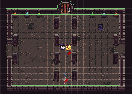
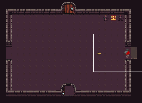
All the tiles I've used in my currently made scenes have used the concept art from my concept document and I consider them to be final graphics for the background/decorations of the dungeon rooms, as I feel that the art used is well suited to the dungeon theme and are consistent throughout the designing process of Dungeonator. With the style of game being related to dungeons, I am able to switch between the look of the rooms for some of the scenes so the player isn't constantly looking at one specific colour scheme throughout the game, this allows for slight variations between rooms going from a lighter background colour to something that's darker to give off a sort of dark and moody vibe to different areas of the game.
The snippet below shows the final graphics of the beginning room for Dungeonator, with all aspects of the room finalised bar the hooded figure's interactions, for what I desire the look and feel of the room should be, a sort of dreary looking place giving off an old style dungeon feel that some may be able to relate to from older games or from possible dungeon maps associated with some dungeons and dragons adventures. The animation of the chest to reveal the weapon and a key being used to unlock the door are shown through GIFs in my previous devlog on enemies/interactions and are also considered to be at their final stage (bar fixing the item position when the player is holding it).

As seen above the image shows a version of the background scheme used for the game whilst below depicts the other dungeon scheme that will be used throughout rooms of my game to give off a different feel to the games aesthetics (Room is quite bare but the enemies and chest are in their final position whilst the key will be in a chest of its own.

Thank you for tuning in for another devlog about my game Dungeonator.
Get Dungeonator
Dungeonator
More posts
- Documentation + User GuideOct 16, 2020
- Game TestingOct 06, 2020
- Polish and UIOct 04, 2020
- Enemies/Interaction/PuzzlesSep 22, 2020
- Basic Level BlockingSep 13, 2020
- Player MovementAug 30, 2020
- Game ConceptAug 28, 2020
Leave a comment
Log in with itch.io to leave a comment.